Charlotte Rohde Drops “Oficía MONO”: A Typeface Dressed Like A Business Suit
The Amsterdam–Berlin type designer stages “good business woman™” as a feminist provocation — typeface included.
Typefaces usually arrive quietly. Charlotte Rohde doesn’t do quiet.
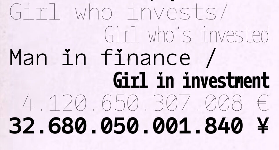
The Amsterdam–Berlin type designer just dropped Oficía MONO — a monospaced serif that looks like it’s been fitted by a Savile Row tailor. Sharp heels. Strict posture. Zero small talk. Launched alongside the Kemmler Kemmler “Make a Statement” campaign, it comes wrapped in one of the most pointed pieces of brand-art writing of the year: a deadpan send-up of the “good business woman™” archetype.
Monospace as power dressing > monospace as code font.
Oficía MONO takes the nerdiest category in type — the fixed-width workhorse built for terminals — and puts it in a pencil skirt. The rhythm is steady. The spacing is deliberate. The vibe is: I run this meeting.
Irony as the whole point > irony as accessory.
The caption isn’t subtle and doesn’t want to be. “Good business woman™” is the whole joke — and the whole critique. Rohde isn’t celebrating corporate femininity. She’s weaponising it, then handing you the typeface to type your own exit memo in.
A typeface with a thesis. A thesis with teeth. File under: design that bites back.