The orange isn’t a colour. It’s a claim.
Your feed is full of brands right now that don’t exist. Half of them were moodboarded into being last week. Colours, fonts, a manifesto, a dropship pipeline, done. It looks like a world. It’s a coat of paint.
Heron Preston (@heronpreston) did the opposite ten years ago and everyone is still copying the surface.
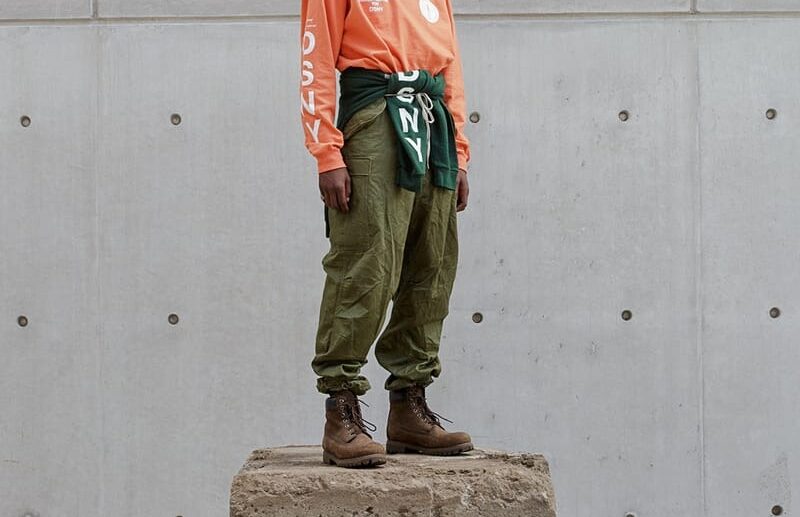
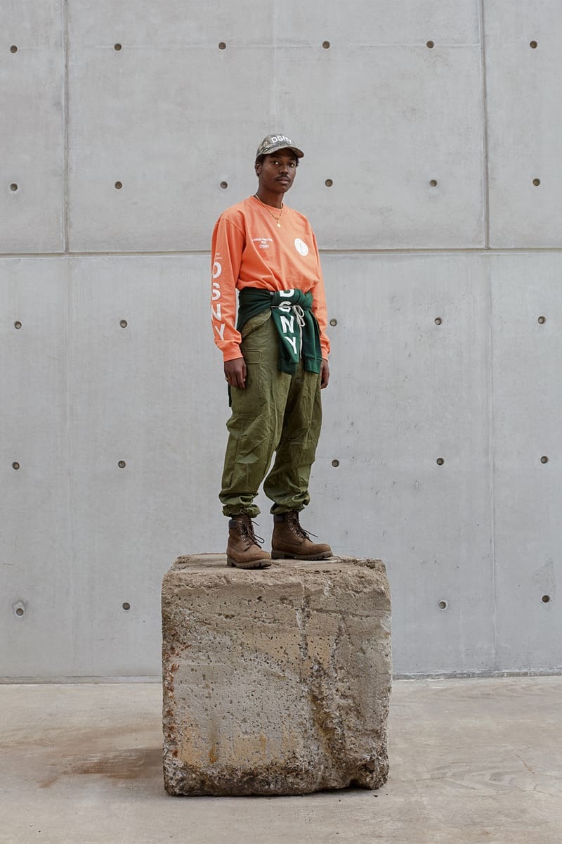
In 2016 he cold-emailed the New York Department of Sanitation (@nycsanitation) with the subject line “Big Idea.” They said yes. He upcycled their actual uniforms, over-dyed them with unsold lots from his own label, and walked the result down a runway at NYFW. The collection was called UNIFORM. The colour was safety orange, and he borrowed it the way you borrow a jacket from the job you showed up to.
That’s the move most people miss. Preston didn’t design a brand. He attached himself to one that already existed. He rented the visual identity of public sanitation workers and paid his rent by actually working with them. The clothes, the colour, the concept. All of it was pre-loaded. He just plugged in.
Now look at the fashion feed in 2026. Synthetic lookbooks, AI-generated house codes, brands whose only real asset is their Instagram grid. A generation of labels that look fully formed on launch day and dissolve by year three because there was never anything underneath the palette.
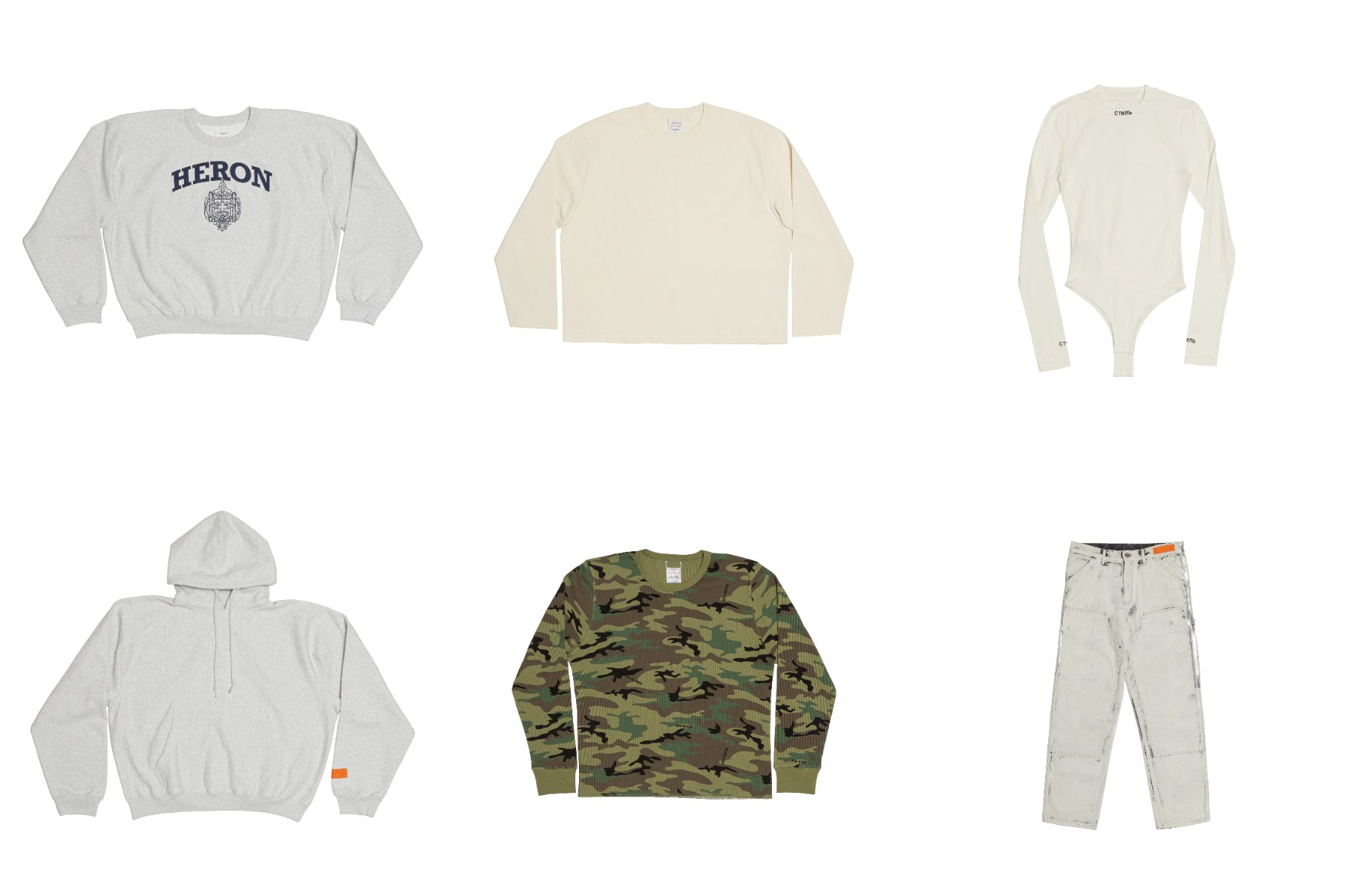
Preston’s brand still works because the anchor is real. It’s a city, a workforce, a piece of infrastructure that exists whether he is paying attention to it or not. The СТИЛЬ patch gets the press. Cyrillic for “style,” a designer-y designer flex. The orange gets the longevity.
Watch the thesis play out on his own site. heronpreston.com doesn’t try to sell you a worldview. Product drops into product like items on a belt. No hero image, no “our story,” no mood film. The site reads like a distribution centre. You’re clocking in.
A lot of designers in his generation went the other way. They stacked moodfilms and brand manuals and universes until the product became an afterthought. Most of them are quiet now. Preston kept it narrow and the niche kept widening.
The shift worth paying attention to, especially if you’re building something yourself right now, is that brand worlds can’t be invented in isolation anymore. You can generate a palette in seconds. You can’t generate a reason for anyone to care. That reason has to be attached to something real. A place, a subculture, a workforce, a craft, a problem. Something that was there before you turned up with your logo.
The younger labels getting real traction this year figured it out already. Look at the ones pulling from apprenticeship culture, municipal typography, regional sport, overlooked trades. They’re running the same play Preston ran in 2016. Find an existing world. Ask to be let in. Do the work. Let the identity of that world become the identity of the brand.
If you’re 22 with a Figma file and a dream, this is the part to take home. Stop designing the brand. Go find the one that already exists. Put in the hours. Earn the uniform. The orange is available to anyone willing to actually pick up the shift.